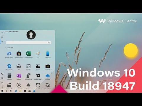
Leaked Windows 10 Insider Build Reveals Revamped Start Menu
Microsoft’s Windows platform has come a very long way from back in the early days of Windows 3.1, where the Start Menu has become synonymous with Windows operating systems. Microsoft has made some changes to the design of the Start Menu over the years, most notably in Windows 8 when the company tried (and failed) to do something new and different.
However, it seems that they aren’t quite giving up yet on redesigning the Start Menu because according to the folks at Windows Central, they have managed to get their hands on a leaked Windows Insider build which reveals Microsoft’s potential new plans for a very much revamped Start Menu.
Now, for the most part, the current iteration of the Sart Menu in Windows 10 is still somewhat reminiscent of the previous designs, where it is still quite intuitive to use. However, with the new design, it seems that Microsoft is going for something very different where it largely relies on icons to show apps that are available.
It’s not the prettiest UI we’ve seen, but as Windows Central points out, this leaked build is an internal build from Microsoft and not one that was intended for those part of the company’s Insider program. This means that what we are seeing could be a very early iteration of the design which could either be scrapped or improved upon, but we’ll just have to wait and see. In the meantime, what do you think about it?
You May Also Like
Popular Right Now
- Canon Unveils PowerShot V1 And EOS R50 V: Best New Vlogging Cameras For 2025
- Bill Gates Predicts: AI Will Replace Doctors And Tutors Within A Decade
- First Shutdown of Niagara Falls in 12,000 Years: A Rare Sight to Behold
- Former Google Engineer claims that humans will achieve immortality soon
- Romotow: The Foldable Camping Trailer Inspired By A USB Flash Drive
- LYRA: Swiss Startup Unveils AR Smart Glasses for Office Work, City Life, And Traveling
- Man Caught in China Smuggling $46K Worth of Intel CPUs Wrapped Around His Waist
- iPhone 15 Pro Max may bring thinner bezels than Xiaomi and Samsung’s latest flagships
- OpenAI's new GPT-4 with a "human-level performance" scored up to 93% on SAT exams
- iPhone SE 4 could be Apple's secret weapon to 'steal' budget customers from Samsung
- Lenovo Launches New Workstations, With Aston Martin DNA
- Ubergizmo’s Best of Mobile World Congress 2023
- TCL NXTPAPER 11 Tablet With Paper-like Screen Experience
- Nothing Phone 2 Coming To The U.S. In Late 2023
- Ubergizmo’s Best Of K-Startup @ CES
- Intel Core i9-13900T Shows Extraordinary Efficiency In Early Benchmarks
