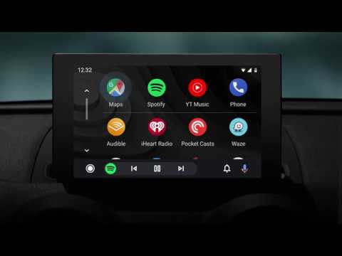
Android Auto Gets A Complete Redesign With Dark Mode Included
It has been over four years since Google launched Android Auto, the extension of its mobile platform into the car. It has looked the same over the years but that’s going to change in the coming months. Google today revealed a major redesign for Android Auto which even includes a dark mode.
Google has said that it’s going to roll out this new design to all Android Auto compatible cars this summer. This interface has been developed to help users get on the road faster, see more useful information at a glance, and to simplify common tasks while driving.
As soon as the car is started, Android Auto will continue playing media while showing the user the navigation app of their choice. There’s a new navigation bar which lets them see turn-by-turn directions and be able to control their apps and phone on the same screen. There’s also a new notification center which shows recent calls, messages, and alerts.
Google has also evolved Android Auto’s design to fit better with a car’s interior. That’s why a dark theme with colorful accents and fonts that are easier to read seems like a good fit for Android Auto. Google will share more information about the new Android Auto experience at its I/O developers conference.
You May Also Like
Popular Right Now
- Google Messages Rolls Out On-Device Nudity Detection With Sensitive Content Warnings
- Google AI Mode Adds Multimodal Search To Mobile App
- Leaked Apple Watch Series 10 Prototype Reveals Unique Health Sensor And Potential Future Features
- Canon Unveils PowerShot V1 And EOS R50 V: Best New Vlogging Cameras For 2025
- Bill Gates Predicts: AI Will Replace Doctors And Tutors Within A Decade
- First Shutdown of Niagara Falls in 12,000 Years: A Rare Sight to Behold
- Former Google Engineer claims that humans will achieve immortality soon
- Romotow: The Foldable Camping Trailer Inspired By A USB Flash Drive
- LYRA: Swiss Startup Unveils AR Smart Glasses for Office Work, City Life, And Traveling
- Man Caught in China Smuggling $46K Worth of Intel CPUs Wrapped Around His Waist
- iPhone 15 Pro Max may bring thinner bezels than Xiaomi and Samsung’s latest flagships
- OpenAI's new GPT-4 with a "human-level performance" scored up to 93% on SAT exams
- iPhone SE 4 could be Apple's secret weapon to 'steal' budget customers from Samsung
- Lenovo Launches New Workstations, With Aston Martin DNA
- Ubergizmo’s Best of Mobile World Congress 2023
- TCL NXTPAPER 11 Tablet With Paper-like Screen Experience
