Android N Could See Google Ditching The App Drawer [Update]

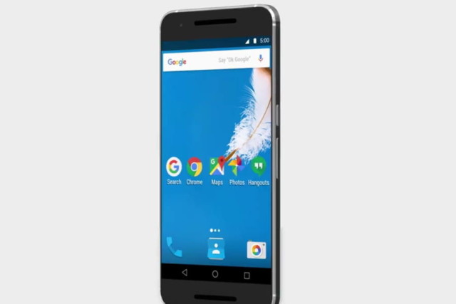
Update – Google has since reached out to clarify that the mockup shown in the video is not an accurate representation of Android’s UI, and that it isn’t a hint of what’s to come. Based on that we can only assume that it looks like the app drawer will be here to stay.
One of the differences between iOS and Android is how they handle your collection of apps. For example with iOS, all your apps are laid bare in front of you. The most you could do is put them into folders, or with some tweaking, hide them from sight. With Android, only what you want to show is placed on your home screen, with the option to access all your apps via the app drawer.
Say what you will, but both versions have their fans and their detractors. However it seems that thanks to a new video that Google has posted online, it has led to a fair amount of speculation that the next major build of Android – Android N – could see Google ditch the app drawer, or at least give users the option of disabling it.
The video in question is that of Google Maps which basically seems to show off a variety of different Google apps and services for Android, like Search, Chrome, Photos, Hangouts, and Maps. What many noticed is that in the video, there does not appear to be an app drawer, which has led to many thinking that it could be hinting at what Android N will be like.
It is possible that the feature was omitted due to this video being a mockup as opposed to an actual phone, so maybe Google removed it as it was not necessary to the video. However we should note that Google isn’t alone in this. For example Samsung and LG have both done something similar to their phones, albeit for now they are options as to whether or not you want to enable the app drawer, but what do you guys think? Is removing the app drawer a good or bad idea?
You May Also Like
Popular Right Now
- First Shutdown of Niagara Falls in 12,000 Years: A Rare Sight to Behold
- Former Google Engineer claims that humans will achieve immortality soon
- Romotow: The Foldable Camping Trailer Inspired By A USB Flash Drive
- LYRA: Swiss Startup Unveils AR Smart Glasses for Office Work, City Life, And Traveling
- Man Caught in China Smuggling $46K Worth of Intel CPUs Wrapped Around His Waist
- iPhone 15 Pro Max may bring thinner bezels than Xiaomi and Samsung’s latest flagships
- OpenAI's new GPT-4 with a "human-level performance" scored up to 93% on SAT exams
- iPhone SE 4 could be Apple's secret weapon to 'steal' budget customers from Samsung
- Lenovo Launches New Workstations, With Aston Martin DNA
- Ubergizmo’s Best of Mobile World Congress 2023
- TCL NXTPAPER 11 Tablet With Paper-like Screen Experience
- Nothing Phone 2 Coming To The U.S. In Late 2023
- Ubergizmo’s Best Of K-Startup @ CES
- Intel Core i9-13900T Shows Extraordinary Efficiency In Early Benchmarks
- Ubergizmo’s Top 3 MIK Products @ CES 2023
- Three LG gram Laptops For 2023. The Lightest Got Even Lighter