iOS 8.3 Introduces Huge Improvement To Apple’s Keyboard

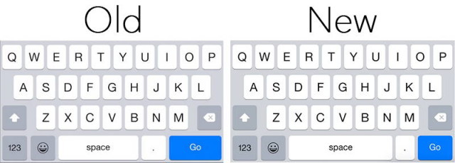
The good news is that with iOS 8.3, it looks like Apple has finally addressed issue and will hopefully make future search queries a lot easier to type. As you can see in the screenshot above, the older keyboard featured a larger fullstop button while squashing the spacebar in the middle, however the newer design shows that Apple has made the fullstop button smaller and elongated the space bar.
Hopefully those with bigger and less precise thumbs will be able to hit the spacebar without accidentally pressing the fullstop. It also looks like Apple has made the “Go” button a bit smaller which may or may not be a good thing, depending on your preference, but we certainly hope that the reduced fullstop button will lead to type typos in the future.
iOS 8.3 has recently been released as a public beta so if you have signed up for the company’s public beta testing program you should be able to download the beta and take it for a spin yourself.
You May Also Like
Popular Right Now
- Google Messages Rolls Out On-Device Nudity Detection With Sensitive Content Warnings
- Google AI Mode Adds Multimodal Search To Mobile App
- Leaked Apple Watch Series 10 Prototype Reveals Unique Health Sensor And Potential Future Features
- Canon Unveils PowerShot V1 And EOS R50 V: Best New Vlogging Cameras For 2025
- Bill Gates Predicts: AI Will Replace Doctors And Tutors Within A Decade
- First Shutdown of Niagara Falls in 12,000 Years: A Rare Sight to Behold
- Former Google Engineer claims that humans will achieve immortality soon
- Romotow: The Foldable Camping Trailer Inspired By A USB Flash Drive
- LYRA: Swiss Startup Unveils AR Smart Glasses for Office Work, City Life, And Traveling
- Man Caught in China Smuggling $46K Worth of Intel CPUs Wrapped Around His Waist
- iPhone 15 Pro Max may bring thinner bezels than Xiaomi and Samsung’s latest flagships
- OpenAI's new GPT-4 with a "human-level performance" scored up to 93% on SAT exams
- iPhone SE 4 could be Apple's secret weapon to 'steal' budget customers from Samsung
- Lenovo Launches New Workstations, With Aston Martin DNA
- Ubergizmo’s Best of Mobile World Congress 2023
- TCL NXTPAPER 11 Tablet With Paper-like Screen Experience