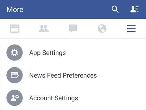
Facebook Tests Out New Android App UI
Could Facebook be testing out a brand new user interface when it comes to its official Android application? Apparently so, as Facebook looks as though they are gradually flicking the switch on for a server-side change to kick in, that will allow the app to enjoy a somewhat Material Design flavor. Earlier in the month of October, Google Now received a new Material Design makeover, and this looks set to continue in the same way.
Facebook has yet to make an official or formal announcement where this brand new user interface is concerned, which will see it introduce a more consistent and colorful iconography to the menu panel, in addition to a flattering look on the whole. Of course, it remains to be seen whether the major effort will be taking the Material Design route, or Facebook could just be making use of some Material Design guidelines which was Google had put out earlier in the year.
It does seem as though this is only for Android, and the distribution pattern happens to be fairly random. Hopefully something official will be revealed soon. After all, it is not as though Facebook had been shy of experiencing its fair share of new updates and changes along the way, right?
You May Also Like
Popular Right Now
- Android 16: Final Version Now Available For Pixel Devices
- iOS 26: Enhancements Coming To Native Apps Including Messages, Music, Notes, And CarPlay
- Lenovo Legion Y700 Gen 4 Launches With Snapdragon 8 Elite And 165Hz Display
- WhatsApp Introduces Voice Chats For All Groups, Inspired By Telegram
- Volonaut Airbike: Lightweight Flying Superbikes With Jet Propulsion Unveiled
- Flappy Bird Is Back! After 10 Years, It Brings A New Game Experience
- Google Messages Rolls Out On-Device Nudity Detection With Sensitive Content Warnings
- Google AI Mode Adds Multimodal Search To Mobile App
- Leaked Apple Watch Series 10 Prototype Reveals Unique Health Sensor And Potential Future Features
- Canon Unveils PowerShot V1 And EOS R50 V: Best New Vlogging Cameras For 2025
- Bill Gates Predicts: AI Will Replace Doctors And Tutors Within A Decade
- First Shutdown of Niagara Falls in 12,000 Years: A Rare Sight to Behold
- Former Google Engineer claims that humans will achieve immortality soon
- Romotow: The Foldable Camping Trailer Inspired By A USB Flash Drive
- LYRA: Swiss Startup Unveils AR Smart Glasses for Office Work, City Life, And Traveling
- Man Caught in China Smuggling $46K Worth of Intel CPUs Wrapped Around His Waist
