 We guess it’s really no secret that at WWDC, Apple would introduce iOS 8. iOS 8 is Apple’s latest mobile operating system, with its predecessor, iOS 7, introducing a host of changes, most noticeably visual changes, to the iOS platform which some felt was long due for a visual overhaul.
So what’s new in iOS 8? Well there are plenty of new things that Apple has made. They’re not overly radical. Instead, these are more “convenient” features that provides shortcuts to the user to make their life easier.
Interactive Notifications
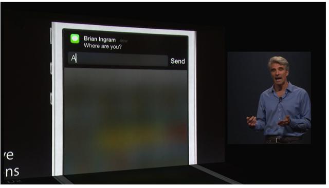
 For starters Apple has changed the way we interact with our notifications. They have made the notifications interactive, meaning that the user can reply to a message via the notification itself, as opposed to having to launch the message app and move away from the app they are currently using.
Apple has also stated that this works with third-party apps, like Facebook, where you could like a notification, such as a photo or status tag, without having to launch into Facebook itself. In fact, these notifications can be interacted via the lockscreen itself, so you will be able to address these notifications without having to unlock your phone.
Quick Contacts Access
 Apple has also changed the double tap feature on the home button. Previously with iOS 7, double tapping the home button brought up the multitasking screen where we can access our apps. Now double tapping will allow users to access their frequently dialed contacts, allowing them to quickly call or FaceTIme them via the multitasking screen.
There have also been new changes made to the Mail app. In fact, some of these changes feels like Apple might have borrowed from Mailbox in terms of features. For example, users will be able to hold and swipe to delete, much like how you would in Mailbox.
Other changes made includes how you can “minimize” a message that you’re composing mid-way to access other messages in your inbox. For example if you wanted to get some information from a previous email but you were composing halfway, all you’d have to do is swipe the message down, and you’re good to go.
Spotlight and Continuity
 There are also some features that Apple has brought over from OS X 10.10 Yosemite. For example the same contextual spotlight search in Yosemite is also available in iOS 8. This means that searching for apps, you can launch directly into the iTunes App Store. This applies to searching for movie times, directions, and so on.
Continuity is also another feature that can be found on OS X 10.10. Just in case you missed our earlier post, Continuity is where you are able to pick up where you left off on any iOS device on your Mac. For example if you’re typing an email on your phone, you will be able to continue and finish up on your Mac. Users will also be able to answer calls, receive messages, and even create an instant hotspot.
QuickType Keyboard
 The keyboard on iOS has always been pretty good at preditction. iOS users switching to Android can probably attest to the fact that iOS keyboards are generally more forgiving. Well it looks like Apple has decided that the keyboard could do with even more improvements, and have announced a keyboard they are calling QuickType.
Basically what QuickType does is that it offers word suggestions, kind of like Android’s keyboards, where words will appear above the keyboard to allow you to choose from. The suggestions will also be contextual and subjective. During WWDC, it was demonstrated that the word predictions were different depending on who you are interacting with. It would suggest more formal words when interacting with a colleague at work, and less formal when with friends.
HealthKit and Health App
 Apple has also announced the HealthKit and the Health app. One of the problems Apple noticed is that while there are tons of health apps and devices out there, they don’t really “talk” to one another. What HealthKit does is that it will consolidate the data from those health apps and devices and processes them in a way that we can understand better.
Also with the user’s permission, it will allow health services, like the Mayo Clinic, have access to your medical information. So for example if you were to use a blood pressure app on your phone, it will be able to compare your results against your records at the Mayo Clinic to see if they have improved to have gotten worse. From there, with permission of course, the Mayo Clinic can then reach out to your doctor to see if they need to get in touch with you.
Family Sharing
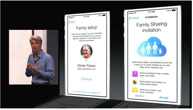
 Now Apple probably knows that within a home, there are probably more than a few family members using iOS devices. Now instead of each family member purchasing the same song because they all want to listen to it on their iOS devices, Family Sharing is where users in a family can share their purchases across the board. This applies to apps, music, movies, books, and more, as long as they all share the same credit card on file.
But what about kids who abuse in-app purchases? Well with Family Sharing, parents will have to authorize any purchases made with the card. For example if someone on another iOS device tries to make a purchase, the parent’s iPhone will be notified of the attempt, and they can choose whether they want to allow it or not. Family Sharing also allows for the sharing of multimedia, like photos and videos.
In Conclusion
There were many new features in iOS 8, some of them felt like conveniences, some of them felt quite new. However there were also a lot of features that felt like Apple could have borrowed from other platforms and apps. That might be a good or bad thing, depending on how you look at it, but as far as iOS users are concerned, perhaps these are features that are long overdue. So, what do you guys make of iOS 8 so far?