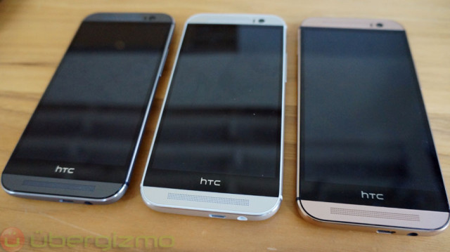
Black Area Underneath HTC’s Logo On One M8 Explained

However it seems that there is one particular feature about the phone’s design that some have been curious about and might have even criticized HTC about, and it is the black bar at the bottom of the phone where HTC’s logo is situated. We’re sure many would have preferred if the screen stretched all the way from the top to the bottom, so it is understandable why HTC decided to make this design choice.
According to HTC’s Jeff Gordon, it seems that this black bar is far from useless. In a tweet responding to questions about the phone on Twitter, Gordon wrote, “That black area with the HTC logo on M8? Underneath is a huge amount of circuitry, antennae, etc. It’s not “empty” by any means.”
Once again we’re sure many would have preferred if HTC had omitted that black bar and perhaps found someone where to place the circuitry, but perhaps due to the rest of the phone’s internal design, they had no choice but to put it there. To to mention it also helps to keep the device thin which is a feature that we can actually appreciate.
You May Also Like
Popular Right Now
- First Shutdown of Niagara Falls in 12,000 Years: A Rare Sight to Behold
- Former Google Engineer claims that humans will achieve immortality soon
- Romotow: The Foldable Camping Trailer Inspired By A USB Flash Drive
- LYRA: Swiss Startup Unveils AR Smart Glasses for Office Work, City Life, And Traveling
- Man Caught in China Smuggling $46K Worth of Intel CPUs Wrapped Around His Waist
- iPhone 15 Pro Max may bring thinner bezels than Xiaomi and Samsung’s latest flagships
- OpenAI's new GPT-4 with a "human-level performance" scored up to 93% on SAT exams
- iPhone SE 4 could be Apple's secret weapon to 'steal' budget customers from Samsung
- Lenovo Launches New Workstations, With Aston Martin DNA
- Ubergizmo’s Best of Mobile World Congress 2023
- TCL NXTPAPER 11 Tablet With Paper-like Screen Experience
- Nothing Phone 2 Coming To The U.S. In Late 2023
- Ubergizmo’s Best Of K-Startup @ CES
- Intel Core i9-13900T Shows Extraordinary Efficiency In Early Benchmarks
- Ubergizmo’s Top 3 MIK Products @ CES 2023
- Three LG gram Laptops For 2023. The Lightest Got Even Lighter