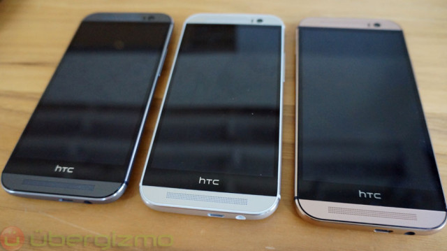
 HTC One M8 was launched just last week and like we have said in the past, it has to be one of the more beautifully designed Android handsets we’ve seen to date. The phone is made entirely from metal, features front-facing BoomSound speakers, and a Full HD 1080p display to top things off.
However it seems that there is one particular feature about the phone’s design that some have been curious about and might have even criticized HTC about, and it is the black bar at the bottom of the phone where HTC’s logo is situated. We’re sure many would have preferred if the screen stretched all the way from the top to the bottom, so it is understandable why HTC decided to make this design choice.
According to HTC’s Jeff Gordon, it seems that this black bar is far from useless. In a tweet responding to questions about the phone on Twitter, Gordon wrote, “That black area with the HTC logo on M8? Underneath is a huge amount of circuitry, antennae, etc. It’s not “empty” by any means.”
Once again we’re sure many would have preferred if HTC had omitted that black bar and perhaps found someone where to place the circuitry, but perhaps due to the rest of the phone’s internal design, they had no choice but to put it there. To to mention it also helps to keep the device thin which is a feature that we can actually appreciate.
Filed in . Read more about HTC One (M8) and Htc One M8.