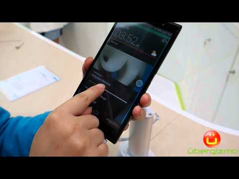
ZTE Grand Memo 2 LTE: Video Hands-On
The ZTE Grand Memo II is not a phone that is well known in the U.S yet, but upon playing with it at Mobile World Congress 2014, I thought that it was another interesting mid-range smartphone that is set to fight in a ferociously competitive handset market for this year. For consumers, handsets like these mean that it is not necessary to pay top dollars to get a large 6” display, a 3200 mAh battery and a decent Android user experience.
What was once the exclusive territory of the Galaxy Note 1 has now become a much broader market with a ton of choices, at least in Asia. The U.S market is a little different because of the huge subsidies that wireless carriers offer. In turn, the U.S carriers subsidies are supported by very expensive plans that have nearly no equal in the rest of the world, even when phones are subsidized.
In places where people pay full price for their handset, those mid-range phones are pretty much the best that many people can afford. Even if they have the means, many users don’t feel the need to buy a high-end phone, because they have a basic usage. For instance, many seniors used to buy high-end phones just for their large screens (hence the Simple Mode in TouchWiz). Now they won’t need to.
Industrial Design
The ZTE Grand Memo 2 has a clean design. The front is nearly all glass and the ZTE branding is relatively discreet. In the video, you can see that the surface below the screen is quite large, and this is a rather noticeable difference when compared to something like the LG G Pro 2 or the Galaxy Note 3 but this is the sum of all these little differences that allow these phones to be price at a much lower price.
The back uses a Carbon-fiber material, which is somewhat unexpected for this type of phone, but this is a sign that handset makers are getting extremely creative with their manufacturing methods and budgets to make these phones appealing. ZTE says that the motivation behind this was to make the device lighter, but it is clear that this is also a design upgrade from a plastic alternative. I like it.
Display
Displays are the second thing that is improved across the board. Since most of these are using 720p displays, which is pretty much the “last-gen” technology, the cost for those is now completely affordable enough to use in this market segment. This is great because if you’re buying a big screen because you don’t see very well, it is likely that you won’t benefit from a higher pixel density screen anyway, so why pay for it?
The display doesn’t use IPS, the best LCD-based display technology, but it looked pretty good, with pretty good color rendering and black levels. Not great, but for the price, it’s very decent.
Software
The Grand Memo 2 runs Android 4.4 (aka KitKat) and ZTE has its own user interface (UI) which has flat icons that gives it a look remotely similar to iOS 7 at times. It looks good, but in general, I really wish that handset makers would stick to the Google UI unless they add a new/unsupported feature.
The UI was not the smoothest that I have seen and at time, things were not as responsive as I would have hoped. I know that the Snapdragon 400 platform can do better than this, and we’ve seen handsets like the Moto G perform better. I suspect that ZTE’s own UI needs some optimizations and this is one of the main issue when people create their own UI. It takes time to perfect it. Samsung used to have that problem with its TouchWiz UI.
ZTE Grand Memo II Specifications
- Android 4.4 KitKat
- LTE or 3G, depending on the region
- Snapdragon 400 (4-core, 1.2 GHz), 2GB of RAM
- 16GB of internal storage + MicroSD extension
- 6” display, 1280×720
- Carbon fiber back
- 13MP main camera
- 5MP front camera
- 3200 battery capacity
- WiFi A/B/G/N/AC, Bluetooth 4.0
You May Also Like
Popular Right Now
- First Shutdown of Niagara Falls in 12,000 Years: A Rare Sight to Behold
- Former Google Engineer claims that humans will achieve immortality soon
- Romotow: The Foldable Camping Trailer Inspired By A USB Flash Drive
- LYRA: Swiss Startup Unveils AR Smart Glasses for Office Work, City Life, And Traveling
- Man Caught in China Smuggling $46K Worth of Intel CPUs Wrapped Around His Waist
- iPhone 15 Pro Max may bring thinner bezels than Xiaomi and Samsung’s latest flagships
- OpenAI's new GPT-4 with a "human-level performance" scored up to 93% on SAT exams
- iPhone SE 4 could be Apple's secret weapon to 'steal' budget customers from Samsung
- Lenovo Launches New Workstations, With Aston Martin DNA
- Ubergizmo’s Best of Mobile World Congress 2023
- TCL NXTPAPER 11 Tablet With Paper-like Screen Experience
- Nothing Phone 2 Coming To The U.S. In Late 2023
- Ubergizmo’s Best Of K-Startup @ CES
- Intel Core i9-13900T Shows Extraordinary Efficiency In Early Benchmarks
- Ubergizmo’s Top 3 MIK Products @ CES 2023
- Three LG gram Laptops For 2023. The Lightest Got Even Lighter
