Bing New Architecture: Introducing Snapshot and Social Sidebar
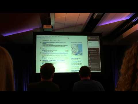
This morning, we were at a press conference at Microsoft’s offices in San Francisco to see a demo of the revamped Bing search engine. Touted as a “new approach to search” by Microsoft, the new architecture features a three columns design, dividing the search activity in 3 distinct areas: Core Web Results, Snapshot and Sidebar (see picture in the complete article – or watch the demo).
On the left, Core Web Results lets the user focus on the traditional topical search and gets the largest portion of the page.
Snapshot, in the middle, delivers additional information related to the “entities”, in the demo, for the query “best seafood restaurant in Chicago”, the additional information related to the entity (restaurants in Chicago) is a map of the city with several restaurants and below users can access various filters such as price, ratings and more. Besides restaurants there are other type of entities, according to Microsoft, that do not necessarily return a map as additional information, technology is one of them.

New Bing interface with Core Web Results, Snapshot and Sidebar - shown at the press conference on 5/10/2012
Sidebar, on the right, pushes information from various social networks and filters the people in the user’s social graph who are the “best experts” on the particular topic searched in the query. Additionally, Bing identifies top experts from networks such as Twitter, Foursquare, Quora, LinkedIn Google Plus and Blogger. From there, people can also directly ask their Facebook or Twitter friends for a recommendation, or check the activity feed and like interesting posts. Check the demo above to see how it works.
The Facebook and social networks integration with the search experience is really nicely done. Today, people find the majority of their news via their Facebook connections, thus, offering a traditional search engine combined with social recommendations and packaged in a user friendly interface is a brilliant idea.
Check the end of the demo above and the second video below to see Sidebar and Facebook integration in action.
You can check the new Bing on this page: http://www.bing.com/new. Microsoft will be rolling out the new user interface in the next 2 weeks.
You May Also Like
Popular Right Now
- Google Messages Rolls Out On-Device Nudity Detection With Sensitive Content Warnings
- Google AI Mode Adds Multimodal Search To Mobile App
- Leaked Apple Watch Series 10 Prototype Reveals Unique Health Sensor And Potential Future Features
- Canon Unveils PowerShot V1 And EOS R50 V: Best New Vlogging Cameras For 2025
- Bill Gates Predicts: AI Will Replace Doctors And Tutors Within A Decade
- First Shutdown of Niagara Falls in 12,000 Years: A Rare Sight to Behold
- Former Google Engineer claims that humans will achieve immortality soon
- Romotow: The Foldable Camping Trailer Inspired By A USB Flash Drive
- LYRA: Swiss Startup Unveils AR Smart Glasses for Office Work, City Life, And Traveling
- Man Caught in China Smuggling $46K Worth of Intel CPUs Wrapped Around His Waist
- iPhone 15 Pro Max may bring thinner bezels than Xiaomi and Samsung’s latest flagships
- OpenAI's new GPT-4 with a "human-level performance" scored up to 93% on SAT exams
- iPhone SE 4 could be Apple's secret weapon to 'steal' budget customers from Samsung
- Lenovo Launches New Workstations, With Aston Martin DNA
- Ubergizmo’s Best of Mobile World Congress 2023
- TCL NXTPAPER 11 Tablet With Paper-like Screen Experience
