 Ever since Google introduced its Material Design language, a lot of their apps and services have been updated to reflect the new design. Chrome on the desktop, however, does not seem to have changed all that much, but that could soon change, according to the folks at The Next Web who spotted the alleged changes.
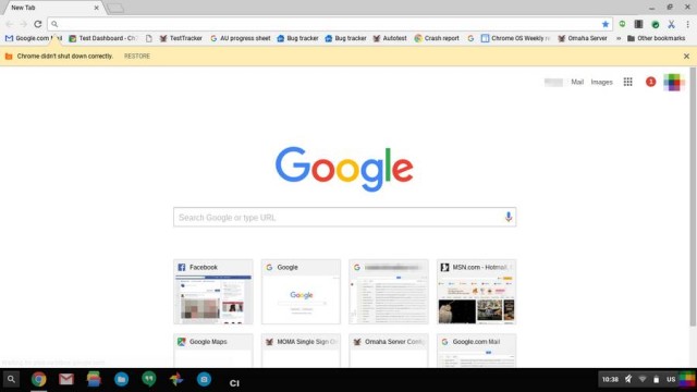
According to the report, they found a filed request on Google Code with references made to Material Design being applied to Chrome, and after tweaking some hidden settings, they managed to get a look at it (see screenshot above). Note that this is an unfinished version, so it might not necessarily reflect the actual end product, but it does show some of the changes Google has made so far.
For starters, while maybe not that obvious, Google has made the edges on the tab square instead of more rounded. The menu button has changed too from the hamburger design to three dots which apparently animate when clicked. Infobars, security icon, and bookmark buttons have all also been changed.
There’s also a redesigned all-black incognito mode that should make it pretty obvious when you are surfing in incognito mode. So far these changes can be enabled if you are running Chrome on your PC or Chrome OS, but unfortunately it doesn’t seem to apply to OS X, at least not for now. No word on when these changes will roll out, but if you’re looking for a UI refresh then perhaps this could be worth looking forward to. In the meantime you can enable these changes by heading on over here for the instructions.